
Blog Post Image Generator: How to Get On-Brand Visuals for Every Article
Get on-brand featured images for every article without a designer. See how a blog post image generator fits your workflow, plus prompts and QA checks.

Dana Willow
Senior Marketer sharing 15 years of marketing wisdom through an AI lens.
Published on July 28, 2026
Updated on October 9, 2026
On-brand visuals for every article, without opening a design tool each time.
Key Takeaways
- A blog post image generator is only useful if its output matches your existing brand system - palette, type treatment, and subject style.
- Most articles need five distinct image slots, not one hero image; plan them at outline stage, not after drafting.
- Disclosure matters: readers penalize brands that hide AI-generated creative, so set a visible policy early.
- Standalone generators create a coordination tax; tools that pair copy and visuals in one pass remove the handoff entirely.
- Free tiers are fine for testing, but watermarks, resolution caps, and licensing limits surface fast at real publishing volume.
What a Blog Post Image Generator Actually Does
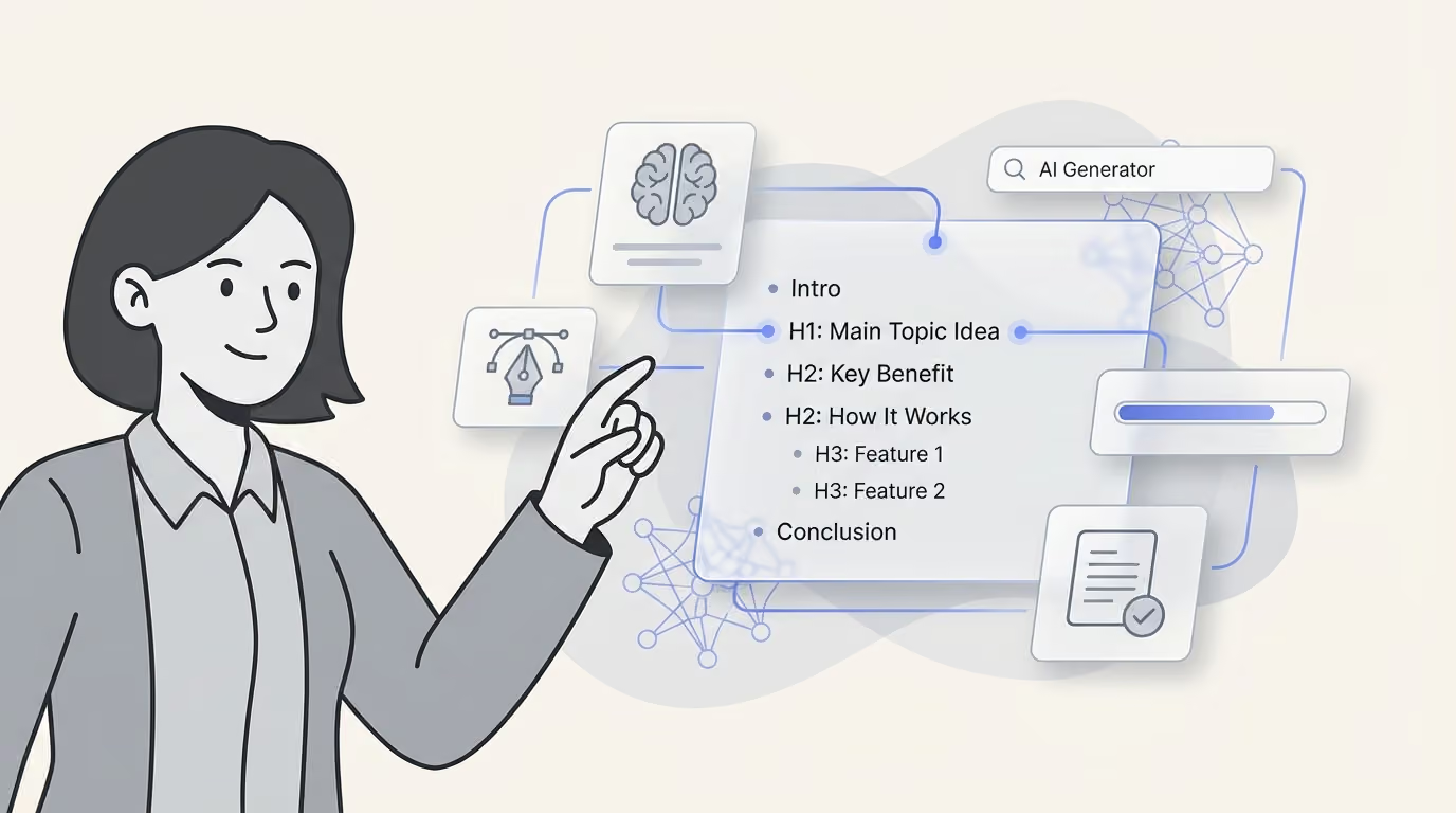
Article context, not raw prompts, drives usable output. A blog post image generator is a production tool that reads a post's headline, outline, or full draft, then produces on-brand visuals sized for that exact placement - featured image, social card, section break, or inline diagram. That distinction matters more than it sounds. Generic text-to-image tools respond only to whatever prompt a person types, with no memory of the article's topic, tone, or prior visuals. An article-aware generator treats the draft itself as the brief, pulling entities, subheads, and intent to decide what each image should communicate. It also keeps a reusable style profile so a ten-post series looks like one coherent set instead of ten unrelated experiments. The output is a packaged asset ready to publish.
- Context ingestion: Reads a headline, outline, or full draft as input context
- Sized asset output: Outputs featured image, OG card, section graphics, and inline diagrams
- Style consistency: Applies a reusable style profile so posts look like a set
- Publish-ready export: Handles alt text, file naming, and CMS-ready export
Text-to-image playground vs. article-aware generator
A playground is exploratory - type a prompt, get a picture, repeat until something looks right.
An article-aware tool is workflow software: it ingests the draft, infers what illustrates each section, and exports files already labeled for a CMS.
One rewards creative wandering; the other rewards editorial speed.
Undisclosed AI creative and reader trust
Disclosure isn't optional anymore. Consumers increasingly feel manipulated when brands use AI in advertising without disclosing it, a warning any team relying on generated visuals should heed.
Why Generic AI Visuals Quietly Damage Brand Recall
Sameness in visuals costs recall, not just aesthetics. When every article on a topic uses the same purple gradient, the same glassy robot hand, or the same stock-style human silhouette, readers stop registering the image at all. Their eyes skip past it the way they skip past banner ads. That's a measurable content failure, not a minor style complaint, because visuals exist to anchor a reader's memory of the piece. Generic AI art breaks that anchor before it forms. The underlying issue mirrors AI slop in written copy: content optimized for speed of production instead of distinctiveness of message. Readers can't recall what they can't distinguish.
The purple-gradient-robot problem
Search any AI topic and the same visual tropes repeat: glowing brains, floating circuits, humanoid robots shaking hands. These images say "AI" without saying anything about your specific point.
A custom diagram tied to your exact argument does both.
Disclosure as a trust lever, not a liability
Hiding AI-generated visuals invites the same backlash; labeling them openly builds credibility instead of eroding it.
The Five Image Slots Every Article Needs
Plan image slots during outlining, never after drafting. Bolting visuals onto a finished draft is how articles end up with a random hero shot and nothing else. A production spec forces the decision upfront: how many images, what job each one does, and what dimensions the CMS and social platforms expect. Most teams treat images as decoration, but each slot below serves a distinct function - click-through, social rendering, scroll retention, process clarity, or proof. Skipping a slot usually shows up later as a weak share preview or a wall of unbroken text. Five slots cover a standard long-form article without overbuilding the brief. Fewer, and social sharing or comprehension suffers; more, and production slows down for marginal benefit. Treat this table as the default checklist for every outline, then adjust per article only when the topic genuinely demands it.
| Image slot | Typical dimensions | Job it does | Prompt anchor |
|---|---|---|---|
| Featured / hero | 1200x630 | Earns the click in feed and search | Headline concept + brand palette |
| Open Graph card | 1200x630 | Controls how the link renders on social | Title text overlay + logo lockup |
| Section graphic | 1600x900 | Breaks up long scroll, restates the point | One idea per graphic, no text soup |
| Diagram or flow | 1400x800 | Explains process steps visually | Named steps, arrows, flat style |
| Inline screenshot frame | Native + border | Proves the product claim | Device frame, brand accent border |
Lock these five into the content brief before writing starts.
A drafted article with no image plan just delays the same decisions to a rushed publish day.
Standalone Generators vs. Integrated Content Platforms
Handoffs between tools create most of the delay. A standalone image generator produces one polished asset, then someone downloads it, resizes it, and re-uploads it into the CMS. A design template library looks efficient until every graphic still needs manual assembly by a human designer. An AI blog generator with built-in visuals skips both steps, but only after its style profile is trained. Stock photo subscriptions solve availability, not differentiation, since competitors often license the same images. Each standalone approach solves one slot in the workflow and quietly breaks the next one. The time spent stitching outputs together before a page ever goes live represents the real cost. Teams publishing weekly rarely notice; teams publishing daily feel it immediately. That gap shows up as missed deadlines, not obviously as a tooling problem.
| Approach | Best for | Hidden cost | Breaks down when |
|---|---|---|---|
| Standalone image generator | One-off hero images | Manual resizing, download, re-upload | You publish more than weekly |
| Design template library | Brand-locked layouts | Every asset is hand-assembled | Volume exceeds designer hours |
| AI blog post generator with visuals | Copy and imagery in one pass | Setup time to train voice and style | Style profile is never configured |
| Stock photo subscription | Realistic people and places | Competitors use the same shots | Differentiation is the goal |
The coordination tax nobody budgets for
Nobody line-items the minutes lost between tools in a project plan.
Yet those minutes surface as friction on every publishing day. An integrated platform keeps creative judgment intact, but removes the reformatting and version-chasing around it.
The key is whether your workflow closes the gaps between tools.
That's the real edge worth building toward.
Prompting for Brand-Consistent Output
Reusable style profiles beat clever one-off prompts. A style profile is a short block of fixed instructions - medium, lighting, color range, abstraction level - that gets pasted into every image request for a brand or campaign. Instead of reinventing wording each time, teams save a stem and reuse it across dozens of assets, which is how AI-generated visuals start looking like a coordinated set instead of scattered experiments. This matters more as generation volume grows: BCG found shopping-related GenAI use climbed 35% in 2025 (BCG study, 2025), meaning more brands are producing more images, faster, with more chances for visual drift. The fix isn't a better single prompt.
It's a locked template that removes guesswork on every regeneration. Below are the habits that separate a consistent, on-brand image library from a pile of disconnected outputs. Each one is a small constraint, but stacked together they function like a lightweight brand system baked directly into the prompt itself.
- Lock a style stem: fix medium, lighting, color range, and abstraction level, then reuse that exact phrasing every time.
- Name hex codes explicitly: "#1A2B4C" renders more consistently than "deep navy blue" across models and sessions.
- Ban the default tells: exclude neon grids, glowing brains, and faceless suits in every prompt to avoid generic AI look.
- Vary subject, hold style constant: swap what's depicted, never the stem - that's what makes a set read as designed.
- Generate in threes and pick: batch three outputs and choose the best, rather than endlessly regenerating for "perfect."
Example stem: "Flat vector illustration, #1A2B4C and #F4A300 palette, soft diffused lighting, minimal abstraction, no neon, no glowing elements - [subject]."
A Pre-Publish QA Checklist for AI Images
Most failures are legibility, licensing, or file weight. A generated image can look flawless in the editor and still break once it goes live, whether that's a blurry logo, a large file dragging down load speed, or a license gap nobody checked. A five-minute checklist catches nearly everything that would otherwise surface after publish, when fixes cost more time and credibility. Treat it as a gate, not a suggestion.
- Text legibility: Text in image is spelled correctly and readable at thumbnail size
- Alt text: Describes the image's function on the page, not the prompt that made it
- File weight: Compressed under target size for Core Web Vitals
- Licensing: Commercial license and provenance confirmed for the model used
- Disclosure: A disclosure line present if the visual could be mistaken for a photo
- Crop safety: Hero image crops cleanly at 16:9, 1:1, and 4:5
Cost, Credits, and Where Free Tiers Stop Working
Free tiers test quality; volume exposes the ceiling. A single hero image on a free plan feels generous, until you're publishing daily and need consistent, on-brand visuals across dozens of posts. Most free-tier limits aren't about generation count alone.
They're about what happens after the tenth regeneration, when credits run low and quality controls loosen. Editorial teams that treat free tools as a permanent workflow often discover the real cost only after publishing volume climbs and inconsistency starts hurting reader trust.
Calculating cost per published article, not cost per image
Cost per image is the wrong metric for a publishing workflow. Cost per published article, counting failed generations, edits, and re-rolls, is what actually matters.
Free plans tend to break down in the same predictable spots:
- Watermarks and resolution caps on export: unusable for print-quality or full-width hero placements
- Ambiguous commercial-use terms: legal risk hiding behind vague licensing language
- No style memory between sessions: every article restarts the brand-consistency problem from zero
- Per-image credit burn during regeneration loops: one "almost right" prompt can drain a week's allowance
Budgeting for regeneration loops upfront, not just the first render, keeps true cost visible before it derails a publishing calendar.
Wiring Image Generation Into Your Publishing Workflow
One pass: draft, visuals, schedule, then publish. The teams that stop treating images as a separate task see the biggest time savings, because the outline already defines what each visual needs to show. Copy and images generated in the same pass stay consistent in tone, terminology, and pacing. That alignment matters more than raw output speed; mismatched visuals erode trust faster than a missing image ever would. A single operational sequence removes the handoffs where most delays and inconsistencies creep in. Publishing pipelines break down at the same seams as any technical workflow: not at the core creative step, but in the handoffs between tools. Fewer transitions between tools provide the solution.
- Approve the outline and mark image slots before drafting begins.
- Generate copy and matched visuals in the same run, from the same brief.
- Run the QA checklist once, at article level, not per asset.
- Push to CMS and schedule social variants from the same asset set.
- Log which visual styles correlate with clicks, then update the style profile.
That last step closes the loop: each published article makes the next one sharper, turning image generation from a one-off task into a compounding workflow asset.
FAQs about blog post image generator
Can I use AI-generated blog images commercially?
In most cases, yes - but only if you check the specific model's license terms first, since commercial usage rights vary between tools and subscription tiers. It's smart to keep provenance records (prompts, generation dates, and the tool used) for every image in case you need to prove ownership or origin later. Many brands also adopt a disclosure policy that flags AI-assisted visuals to readers, which builds trust and keeps you in line with emerging transparency expectations in 2026.
Do AI images hurt SEO?
AI images themselves don't hurt SEO - but how you handle them does. Descriptive alt text and reasonable file weight (compressed, properly sized images) matter just as much as they do for any other visual, since slow-loading pages and missing alt attributes both drag down rankings. What matters more than whether an image came from a camera or a generator is originality: unique, non-duplicated visuals signal quality to search engines, while generic stock-like AI images add little value.
How many images should a blog post have?
A good rule of thumb is one image per 300-400 words of body copy, which keeps long-form articles visually broken up without feeling cluttered. In practice, that usually means a hero image at the top plus supporting section graphics placed after major subheadings to reinforce key points and give readers a visual breather as they scroll.
What's the difference between a blog post image generator and an AI blog post generator?
A blog post image generator is visual-only - it creates graphics, headers, and illustrations to pair with content you've already written. An AI blog post generator produces the copy plus accompanying assets in one workflow. The tradeoff is handoff cost: using a dedicated image tool means manually matching visuals to your draft, while an all-in-one generator saves that step but may offer less control over image style and brand fit.
Are free AI blog image generators good enough?
Free tools are fine for testing ideas, drafting concepts, or low-stakes internal use. For a published, on-brand blog, though, they often fall short - watermarks, capped resolution, and limited style memory (the inability to consistently recall your brand's look across sessions) make them impractical for a professional, recurring content calendar in 2026.
How do I keep AI images consistent across a whole blog?
Consistency comes down to reusing a locked style stem - a fixed prompt fragment describing your art style, lighting, and composition - paired with fixed palette hex codes so colors never drift between posts. From there, only vary the subject matter in each prompt while keeping the style and color instructions identical, which gives every image a cohesive, recognizably on-brand look.
Five Mistakes That Make AI Blog Images Look Cheap
- Generating one hero image and calling it done: A single featured image leaves 1,500 words of unbroken text. Plan section graphics and an OG card at outline stage so the visual rhythm matches the reading rhythm.
- Changing the style with every post: Brand recall comes from repetition. Lock a style stem - medium, palette, lighting, abstraction level - and vary only the subject across articles.
- Letting the model render body text: Generated typography garbles at small sizes and undermines credibility. Compose text as a real overlay layer instead of prompting for it inside the image.
- Skipping alt text or pasting the prompt into it: Alt text should describe the image's function for a reader who cannot see it. A raw prompt string helps neither accessibility nor search.
- Hiding that visuals are AI-generated: Readers react badly to undisclosed AI creative. A short, plain disclosure line costs nothing and protects trust.
About Dana Willow
Author
Senior Marketer sharing 15 years of marketing wisdom through an AI lens. Teaching founders to automate smarter.